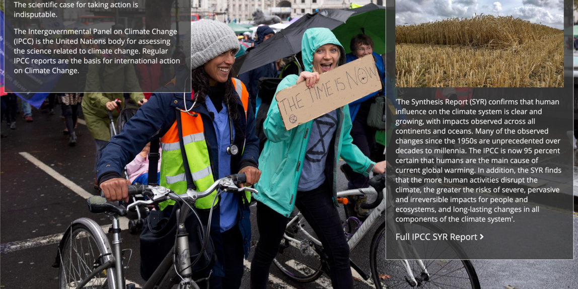
The public outcome of my FMP is a website called And The Waters Increased
Building a website was always a logical choice as I have relevant skills. I’m familiar with HTML5, CSS and JavaScript which are the languages used to construct websites. The ongoing Covid 19 pandemic meant that exhibitions in public spaces simply could not be planned, so placing my project online seems almost the only choice open to me.
As the pictures are presented as hyperphotographs, I need a method of introducing the additional content. I tried clickable areas and mouseover actions to activate the additional content but couldn’t achieve what I wanted.
I wanted the display of the picture to be as pure as possible, yet at the same time for the navigation to be simple and obvious. No navigation may look good, but doesn’t help the viewer.
I eventually settled for five very small icons in the bottom right of the picture.
<< Homepage
< Previous
Up arrow – show content
> Next
>> End
When content is showing, up arrow is replaced with a down arrow which hides the content. One icon to display content meant that just one action would be required. No multiple clicks.
The conventional approach to a story on the web would be to place images either in a gallery or on consecutive pages. Adding content to pictures in a gallery would be problematic, but not impossible. I wanted the pictures to be as large as possible and was concerned about the loading times of the image files.
My solution was to place all the images for a story in one page and navigate between them by jumping from one anchor tag to the next. When the page loads, a quotation is the first thing a viewer sees. Whilst they are reading this, the images have time to load in the background. Then as the viewer navigates the page, they move from image to another all of which are fully loaded.
I did some experimenting with dialog boxes and methods to overlay the additional content. The best results came from styled div elements placed with absolute positioning over the image. Such elements are difficult to turn on and off. My solution here was to show an image twice, one with just the navigation icons and the other with the overlaid divs. The up arrow navigates to the overlaid image and the down arrow navigates to the pure image. The change is instant as the image files have already loaded.
So although the four stories have around fifty images, they are displayed in only five pages with very tightly controlled navigation maintaining a slick user experience.
